How To Create Waterfall Chart in MS Excel
- Dp

- May 7, 2019
- 2 min read
Let us learn How To Create Waterfall Chart in Excel.
This kind of chart looks like a waterfall and that's the reason why it has been called as Waterfall Chart.

In this tutorial, let us see in detail how to create a waterfall chart in excel.
Here in this example, I have got sales data for 6 months like shown.

Step 1: First, I will be creating dummy row under this sales data and put the formula in cell D8 as = C7+C8, which actually gives the cumulative count of sales

Step 2: Drag this formula to the right side till the Total column, to apply the same formula.

Step 3: Now select the entire data from B6 to I8, from the right corner with the quick analysis tool (Ctrl+Q), Insert a Stacked chart like shown below.

Step 4: Now in the chart, We need to now move the red series to bottom and keep the blue series on top, to do that right click and select the option select data.

Step 5: Select the Dummy series and click the up arrow button to move the dummy series up in the order.

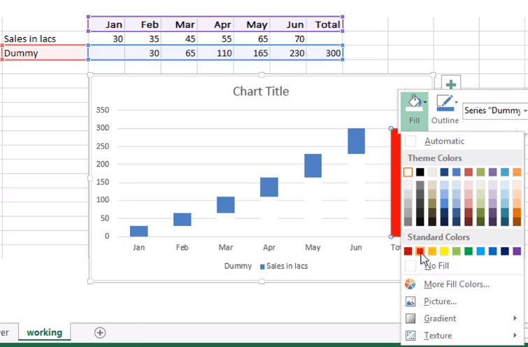
Step 6: By doing this, you will observe that the red series in the chart has gone to down from the top portion. Right click on the red/dummy series and fill it with white color to make it transparent.

Step 7: See that the Dummy series has been shown in white color.

Step 8: Now, select the Total Bar and fill it with some bright red color.

Step 9: As a final step, add some formatting styles like
Type the Chart title,
Remove the gridlines,
Give some eye catching colors to the Sales bars,
Insert data labels etc.
And then a visually appealing waterfall chart can be created like shown below.

Watch this video tutorial for better understanding:
If you liked this tutorial, share it with your friends. And also you can follow us on Youtube, Twitter and Facebook. We would love to hear from you, Please do comment, suggest or compliment our work and we shall make it better for you. You can write us at dptutorials15@gmail.com

תגובות